← Back

Nothing Gen UI

Nothing's Gen UI lets non-technical users create and deploy AI-powered phone widgets. My team was tasked with rebuilding the entire app in a single sprint to raise the bar across the board. I had sole responsibility for the frontend.

Overview of the Essential App Builder editor

The editor is split into a chat panel for prompting the agent, a code view, and a live preview, with a gallery of every widget you have created so far.

Mobile

The original had room to improve on mobile, which matters for a widget builder whose whole point is putting widgets on a phone. Getting mobile right was a key focus of the rewrite.

The old version is on the left, the new one on the right. The rewrite adds a bottom toggle to switch between chat and preview, and improves spacing and contrast throughout so the app stays legible at phone size. It also introduces a top bar that surfaces the information that matters most, such as the current version, alongside a burger menu that holds navigation.

Deploy Flow

Once happy with the preview you can deploy the widget to your phone. The backend compiles the React Native code into a real app that lives in the widget drawer.

The original ran everything in sequence: a starting screen, streamed build logs while the server compiled the app, then a form to name the widget, then a completion screen. Four surfaces one after another, and 40 seconds in this video. The logs served no purpose for a non-technical user, since nothing on that screen was theirs to act on, so they only added waiting time and risked confusing them.

The rewrite starts the compile the moment Deploy is clicked and lets it run in the background. To parallelise the work the form is shown straight away, so the build happens while the user fills it in. Once the form is done, a success, failed, or under-review (when publishing) screen appears. That is two surfaces instead of four, and the same process takes 12 seconds in this video.

Widget Size

The app offered two sizes, square and landscape, but the choice was hidden in the message input as an ambiguous toggle. User feedback showed people missed it entirely and assumed square, the default, was the only option.

Change the size after the widget exists and the agent re-optimises for the new grid, rewriting the layout rather than squashing the old one into it.

The video shows how the rewrite makes it an explicit selection on the first prompt, bringing intentionality to the widget's design from the start.

Version History

Every prompt produces a new version of the widget, so the app keeps a full version history. You can restore any earlier one, which clones the version you pick into a fresh version at the top of the history. The version number ticks up and the preview switches to show that new latest version.

The problem was that Restore read as Preview. People expected clicking it to simply display that version in the editor, and visually that is what happens. But it also adds a new version: with 14 versions, restoring v2 quietly creates a v15 that clones v2. It was easy to assume you were only previewing and never notice the version number had gone up.

The fix puts Preview and Restore in a dropdown as separate choices, so Restore is no longer taken for a preview. That still left what Restore actually does unclear, so a dialog now appears once to explain what happens when you click it.

Gallery

The rewrite fetches only what fits on screen, shows skeleton cards on slow connections, and uses optimistic updates for rename and delete. Fully keyboard-navigable with semantic HTML throughout.

Preview Architecture

The widget preview runs inside an iframe so a broken widget can't crash the editor. In the original that iframe had its own backend connection and state, which could drift out of sync with the parent silently. The rewrite makes the main app the single owner of state. The iframe's only job is to receive files via postMessage, bundle them, and report back.

Engineering

The rewrite uses Tailwind exclusively with design tokens for colour and typography. ESLint bans any, so every prop and API response is fully typed. useEffect was replaced almost entirely with TanStack Query, keeping data in the cache rather than spread across component state. Components are organised by feature, so each area of the app owns its own hooks and utils.

Tooltips

Icon-only buttons are ambiguous, so every one got a tooltip explaining what it does.

Tooltip explaining an icon button in the editor toolbar

Fun

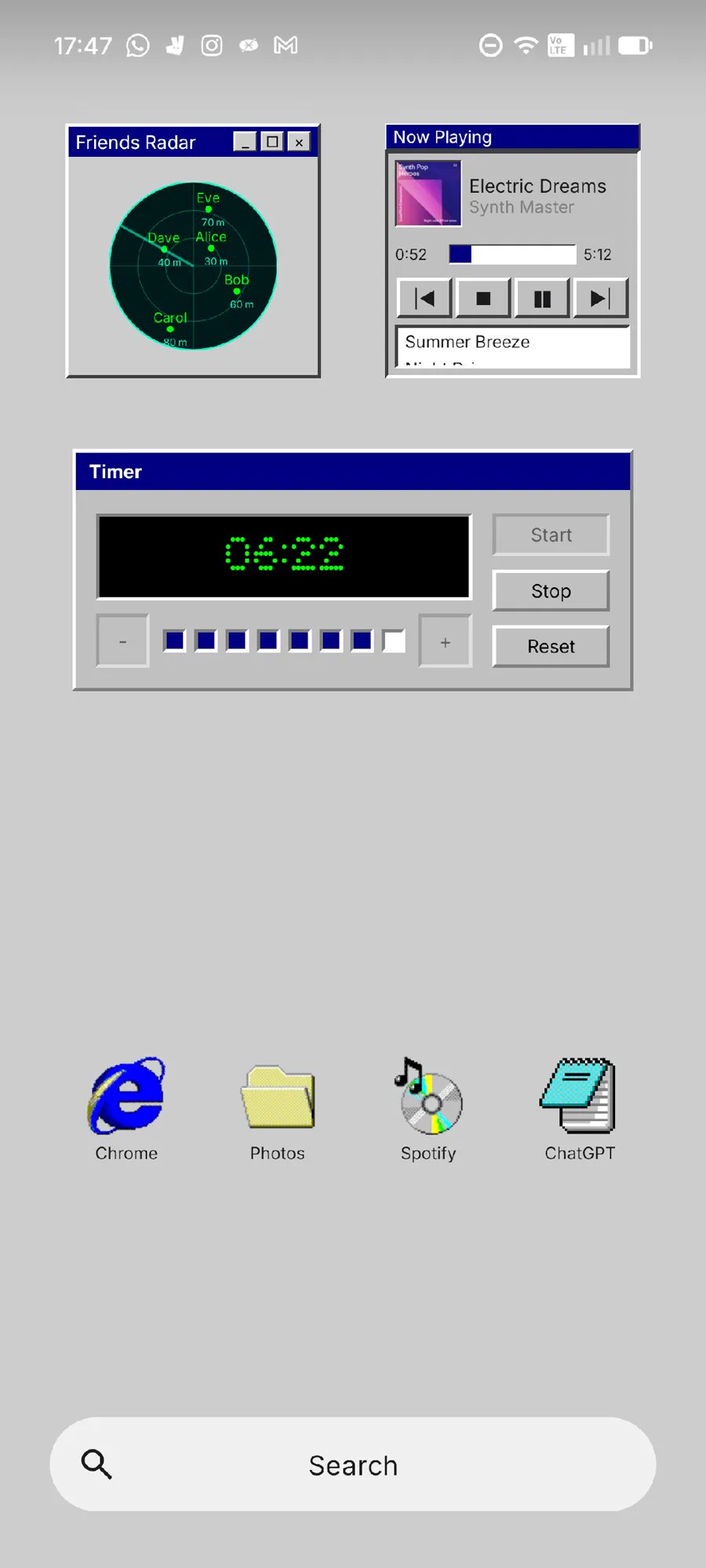
Some fun widgets made along the way.

Windows 98 themed widgets on device